
Following our earlier article on the shortcomings of using human-wave tactics in bus planning to combat overcrowing on rail lines, it’s probably timely that we not just look at the data for City Direct services in northeastern Singapore (that are central to the ridicule of empty peak express buses), but take on a broader view of peak express bus services in general. We gave a quick glimpse of those statistics in the previous post for selected City Direct services serving residential estates in the northeast, and chances are readers will be curious to know how the other peak-only express bus services will fare too.
On a side note, it was later reported that 9% of NEL peak commuters had chosen to take the train during peak fringe periods, when free travel is currently offered under the TSJ 2.0. In comparison to these substantial numbers, the effect of spamming multiple City Direct services in the northeast on reducing train crowding appears dismally insignificant. Exactly how many people are these CDS services removing from the MRT crowd?
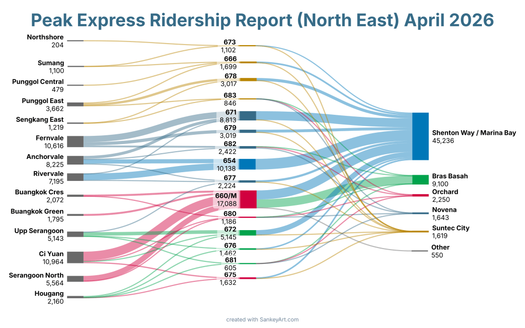
Well, we have been working on that for a while now, and we are delighted to announce the completion of our first formal report on public transport data, starting with the relatively easier task of reporting and analysing ridership on our peak-only express bus services. Inspired by the earlier article, we expanded the report to include all forms of peak-only express bus services, including legacy Express services and the current City Direct series. Attached below is the full report, which takes a deep dive into how our peak-period express bus services are performing in terms of ridership. This is based on morning peak ridership data obtained from LTA’s DataMall, which is a more significant indicator of the value of these services for commuters living all across Singapore.
Beyond just measuring the overall ridership through the express sectors (where these services define their purpose), the report also breaks down individual ridership by different origin and destination sectors in the residential and downtown sectors of the various routes out there intended to offer residents a one-seat ride from their home to their workplace. Some results were sort of expected, but there are some surprises that not even we did expect too.
If the sheer size of the 92-page report intimidates you, simplified infographics are also provided below for you to make a general sense of all those numbers too. The PDF for these diagrams can also be downloaded below.

A new form of STC content?
Because this is significantly different from our past publications that come in the form of loose blog articles (STC Commentary), this also marks the beginning of another publication series for STC. Tentatively named STCommuter Reports because we haven’t found a good name for it yet, this new series will feature various report documents on public transport in Singapore, such as data obtained through LTA DataMall sources and elsewhere, as well as a channel for more formal and serious analysis than can be offered within the limited confines of a blog article. Do subscribe to our page to not miss our new publications, and do expect more varied content on this site in future too~!
Interested in building a better future for Singapore’s transport? Join the STC community on Discord today!

Leave a comment